I’m finally beginning my long-standing Mandelbrot Set project, and the early results are better than I expected. My purpose in this project is to fill a gap I see in the world of Mandelbrot Set software/websites, which I can summarize by explaining what I think are the benefits and drawbacks of the three main formats currently available: images, video, and interactive software.
Images are good because they offer high detail, and they are always available once they have been drawn. Images are bad because they give no context – most of the wonder in the Mandelbrot Set is the sheer scale involved, and a single image does nothing to communicate this.
Video is good because it can do a very good job of communicating the “size” of the Mandelbrot Set, but the quality is usually significantly lower than still images, in order to keep file size down. This isn’t inherently the case, but generally.
Interactive software beats both images and video for its interactive-ness. The user can move about as she pleases, looking at whatever she wants, while the previous two formats define beforehand what can be seen. The downsides are that interesting things can take a while to find (which could easily frustrate a casual user), and the limits of interactive computational feasibility are easily reached. Zoom in for a minute using any tool, and you’ll either find yourself waiting ten minutes at a time for each new image, or else you’ll have zoomed in so far that any tool which can only handle double precision arithmetic (most of them) cannot go any further.
What I want is to combine some of the best qualities from each of these into a new format. I’m planning on building a web interface that will have thousands of images pre-drawn, and present them in an interactive way, where the user starts in the main view (of the whole set), and is given several choices of points to zoom in on. In any available direction, the user can continue zooming in incrementally, sometimes given several choices branching off, but usually just one. The advantages of this format are:
- High-quality images (like the image and software formats)
- Intrinsic sense of scale (like the software and video formats)
- Interesting places highlighted (like the image and video formats)
- Heavy computation done beforehand (like the image and video formats)
- Quasi-interactive experience (like the software format)
- Choice of various palettes (like the software format)
- Unlimited zoom
The palette choices will be available because I’m designing the system so that it computes the necessary data and saves it in a pre-processed state, from which images in any palette can be drawn on demand.
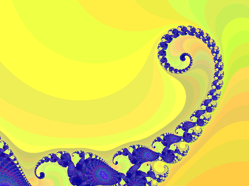
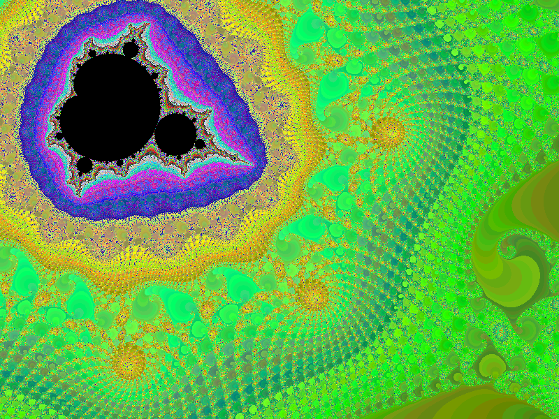
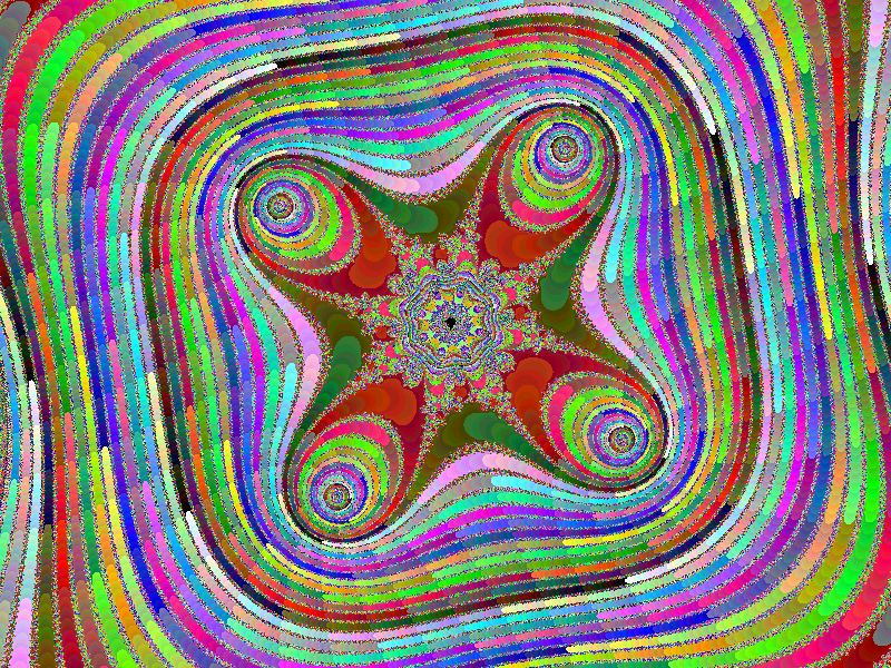
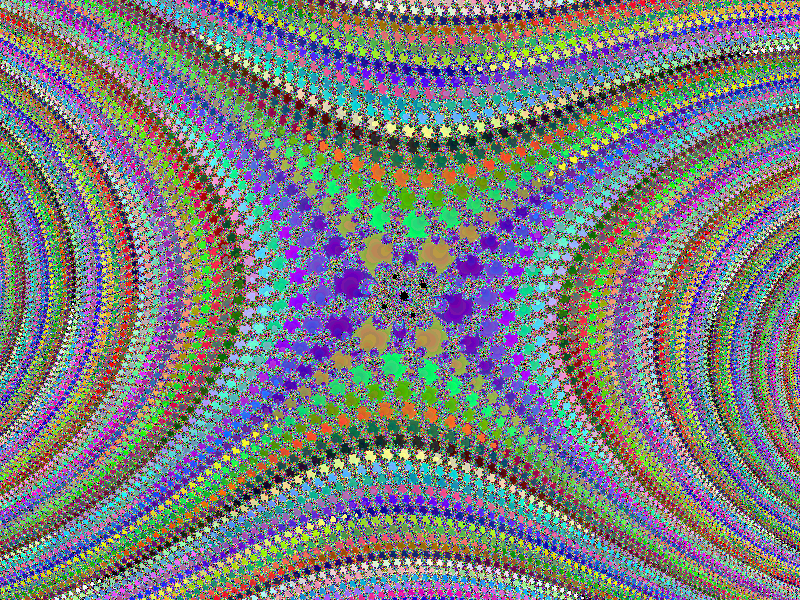
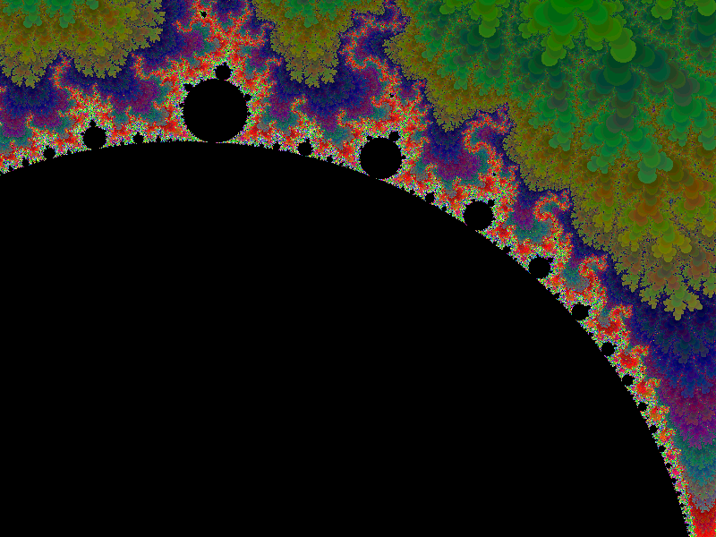
I’ve nearly finished the computation-heavy back-end, and I have some sample images available. These were all drawn using a quick palette I coded ad-hoc just to get some color, and it surprisingly turned out pretty good. Click on any of these images for a larger version.

So I’m excited. I’ve already been able to use it to see farther than I was ever able to in certain areas that I’ve been interested in, and it hasn’t disappointed. There are a few bugs to work out, and a whole user-friendly UI to build, but I think it’s off to a good start.
Comments