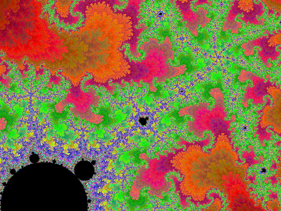
I enjoy anything that can give meaning to really large numbers. For example, the fractal program I recently started has generated the following image:
If we take this image to be roughly six inches across (an idea easier to accept if you click and view the enlarged version), and try to describe the size of the entire fractal at that scale, it turns out to be so large that if you start with some object whose length is the diameter of the observable universe, it would take ten million of these objects for every possible chess position (the Wikipedia puts the number of chess positions at approximately 1050) laid end to end to span it.
And I only just started a couple weeks ago.
Don't Read This, It's Not Worth Your Time
2009-12-14irb(main):001:0> "this is fun".gsub("","yep").gsub("","it is")
=> "it isyit iseit ispit istit isyit iseit ispit ishit isyit iseit ispit isiit isyit iseit ispit issit isyit iseit ispit is it isyit iseit ispit isiit isyit iseit ispit issit isyit iseit ispit is it isyit iseit ispit isfit isyit iseit ispit isuit isyit iseit ispit isnit isyit iseit ispit is"
Comments
New Mandelbrot Format
2009-12-08I’m finally beginning my long-standing Mandelbrot Set project, and the early results are better than I expected. My purpose in this project is to fill a gap I see in the world of Mandelbrot Set software/websites, which I can summarize by explaining what I think are the benefits and drawbacks of the three main formats currently available: images, video, and interactive software.
Images are good because they offer high detail, and they are always available once they have been drawn. Images are bad because they give no context – most of the wonder in the Mandelbrot Set is the sheer scale involved, and a single image does nothing to communicate this.
Video is good because it can do a very good job of communicating the “size” of the Mandelbrot Set, but the quality is usually significantly lower than still images, in order to keep file size down. This isn’t inherently the case, but generally.
Interactive software beats both images and video for its interactive-ness. The user can move about as she pleases, looking at whatever she wants, while the previous two formats define beforehand what can be seen. The downsides are that interesting things can take a while to find (which could easily frustrate a casual user), and the limits of interactive computational feasibility are easily reached. Zoom in for a minute using any tool, and you’ll either find yourself waiting ten minutes at a time for each new image, or else you’ll have zoomed in so far that any tool which can only handle double precision arithmetic (most of them) cannot go any further.
What I want is to combine some of the best qualities from each of these into a new format. I’m planning on building a web interface that will have thousands of images pre-drawn, and present them in an interactive way, where the user starts in the main view (of the whole set), and is given several choices of points to zoom in on. In any available direction, the user can continue zooming in incrementally, sometimes given several choices branching off, but usually just one. The advantages of this format are:
- High-quality images (like the image and software formats)
- Intrinsic sense of scale (like the software and video formats)
- Interesting places highlighted (like the image and video formats)
- Heavy computation done beforehand (like the image and video formats)
- Quasi-interactive experience (like the software format)
- Choice of various palettes (like the software format)
- Unlimited zoom
The palette choices will be available because I’m designing the system so that it computes the necessary data and saves it in a pre-processed state, from which images in any palette can be drawn on demand.
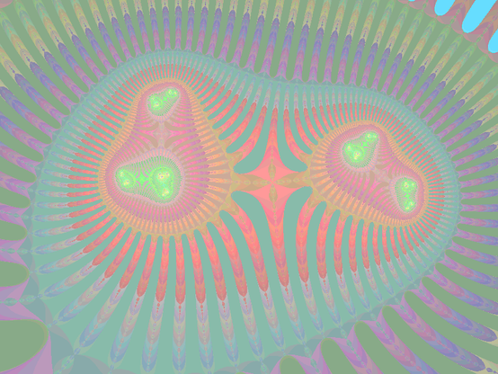
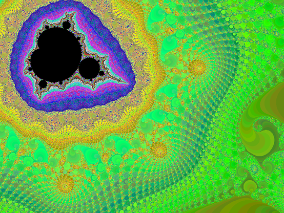
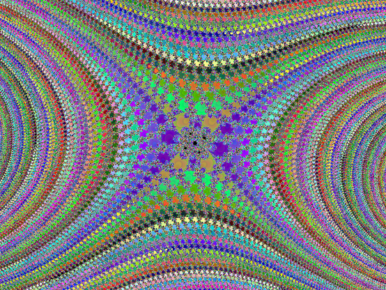
I’ve nearly finished the computation-heavy back-end, and I have some sample images available. These were all drawn using a quick palette I coded ad-hoc just to get some color, and it surprisingly turned out pretty good. Click on any of these images for a larger version.
So I’m excited. I’ve already been able to use it to see farther than I was ever able to in certain areas that I’ve been interested in, and it hasn’t disappointed. There are a few bugs to work out, and a whole user-friendly UI to build, but I think it’s off to a good start.
Comments
Why Your Grandma Can't Learn Computers
2009-11-21I was using my puter during class the other day when I was reminded of something I’ve thought about in the past, which is the reasons why your grandmother is never going to learn computers.
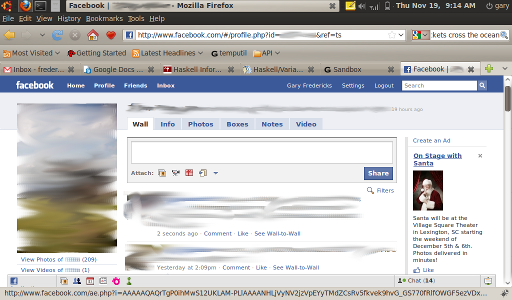
Let’s look at all of the different things going on in this screenshot, and the distinctions between them.
First of all, we have no less than six control bars that Grandma will have to look through to find the thing she wants to click, all stacked one on top of another.
The first one contains, among other various operating system features, the ability to switch between different programs. Grandma doesn’t know what a program is, so this will be a source of confusion.
The second line has seven different menus for this particular program, Firefox. If Grandma has figured out that Firefox has something particularly to do with the internet, or is even aware of Firefox as a distinct entity, it’s time to start questioning if she’s really a grandmother.
The third line has navigation buttons and two different text fields. The navigation buttons will be a source of confusion because Grandma’s not aware of the distinction between using the web browser and doing something else. So for example if she opened the web browser by clicking an icon on the desktop and she has a general sense of what the “back” button is supposed to do, she’ll probably expect that if she clicks the back button it will take her back to the desktop where she can click on the pictures folder. However, the back button will probably be disabled since this is the first page Grandma has opened, leading her to think that the computer is broken or doesn’t like her.
Then there’s the subtle distinction between the two text fields. You could try explaining to Grandma that if she has an explicit “web address” (it’s something that ends in “dot com”, or maybe “dot something else”, and it might have something after that too; if it starts with “www” that’s a good sign, but that’s not guaranteed either) she should use the left one, and use the right one for other things, but that’s probably not necessary since they’re almost interchangable: if you type your google query into the left text field, it’s probably going to search google, and if you type a web address into the google search field you’ll probably be at that site in a click or two. So the two text fields don’t represent two distinct functionalities, but instead are merely a reminder to Grandma that she doesn’t know what’s going on.
The fourth line has bookmarks. If Grandma has any bookmarks, she’ll end up using them to open up the same page repeatedly, since she doesn’t know about tabs and can’t tell that the page is already open in a different tab. This gets worse if she does figure out to click on the tabs some of the time (maybe just because she thinks they’re bookmarks), because it will seem that the browser can only remember the exact page she was on some of the time, and the rest of the time it forgets and takes her to the main page (the one actually bookmarked).
The fifth line has different browser tabs. Grandma will of course confuse these with the bookmarks and with switching between different programs. Just try explaining to Grandma the difference between a link that opens a new tab and a link that changes the location of the current tab (which is an important distinction if she’s going to be able to get back to the page with the original link). Did she understand it? I didn’t think so. Good thing you didn’t mention the possibility of a link opening an entirely new window (whatever that is).
Then there’s the sixth line, which has various navigational links for getting around Facebook. You never should have set up a Facebook account for your grandmother, but since you did here’s how things get worse: Grandma doesn’t understand the distinction between Facebook and the internet in general (or her operating system). Especially now that this 6th bar has a search field as well. So Grandma can’t tell if she’s supposed to search for things in the Facebook search bar or the web browser search bar. The Facebook one will give her general web results underneath all of the pages and groups results, so she might tend to use that exclusively, but that gets problematic if she’s on a site other than Facebook. So then she’ll tend toward the browser search bar, but wonder why she can’t get her nephews’ pages to show up in the results like it did that one time.
And then of course there’s more links, which have a similar functionality to tabs, except that you can’t tell which one you’re on. The “Home” link particularly may be confused with the Home icon in the third row of things, if she’s figured out what that does.
So far we have three standard tab-like ways to switch between activities: switching programs within the operating system, switching tabs within the browser, and switching primary pages within Facebook. Could it get any worse?
Of course! Because she’s on the profile page for one of her relatives where it has tabs for “Wall”, “Info”, “Photos”, etc. So she can even switch tabs within the same page on Facebook.
By now the odds that Grandma will have any idea what’s going on are not the kind that you’d want to risk even mildly serious money on. But just for good measure, let’s throw in a little Facebook navigation bar at the bottom, with some more buttons and things. That’ll teach HER to try to keep in contact with her family.
Comments
Light-Bot Again
2009-11-16Sometime back in high school my programming teacher let me borrow a book about math or computing or something, and all I remember from it now was a chapter on genetic programming. It described a way to “grow” a “program” that could predict the numbers in a repeating sequence, by starting with a bunch of random “programs” (they were essentially finite automata), ranking them based on how well they predicted the sequence, and then simulating biological evolution with these programs as the organisms, and their “code” as the DNA. Simulating evolution is done through three mechanisms: mutation, recombination, and natural selection. For mutation we randomly change part of the program. For recombination, we take two programs and mix their code together to make a new one. For natural selection, we rank the programs based on how well they predict the sequence, and discard the worst ones. We iterate through the process over and over again, and slowly the fitness of the population improves, and eventually we hope to grow a program that does what we want.
Of course I had never heard of this before, but I thought it was terribly fascinating. I implemented the example the book described on my TI-83+ calculator, and had a little fun with that, but eventually put it up on my mind’s shelf.
Many years later (and also just several months ago) I was poking around on the internet and found a simple flash game called Light-Bot (which I described in this post, which I quickly realized would make a good way to experiment with genetic programming again.
I fiddled around with it some initially (at the time my employer wanted me to learn Scala, so I took that as an opportunity to get paid to mess around with Light-Bot and hacked together an implementation in Scala), but didn’t get too far until I had the opportunity to speak at the local IEEE chapter, so for a couple weeks I did a bunch of coding to get together some good examples for an hour long presentation.
Since I like posting interactive things that I’m interested in on my website, after the presentation I spent another few weeks twisting what I had made into a decent public website that displays my results and allows the user to interactively experiment with it in much the same way I do. I hope it’s user-friendly enough to be interesting to people. I included a good amount of explanations and thoughts on the main page (much more than in this post), so hopefully it will also be clear enough to use. Any questions, suggestions, or comments are welcome.
Anyways, it’s here.



Comments